Which Cover?
- Thread starter Incisions
- Start date
to be honest, the lamb shit came later.. it was just la's most blunted at first, and not only horrorcore.. we probably done more weed cuts than horrorcore.. la's most blunted became an acronym and eventually came the lamb symbolism=anti-brainwash..most of us eventually become sheep and a select few remain lamb; pre-programming.

^thats the mixtape we did a while back..i kno, terrible quality, but to answer ur question, naah, shit aint restricted to just lambs

^thats the mixtape we did a while back..i kno, terrible quality, but to answer ur question, naah, shit aint restricted to just lambs
Last edited:
Props:
S.SAVAGE and S.SAVAGE
I have to agree with some of the replies on here. The lamb has to go, the whole weed image has to go as well IMHO.
L.A's most blunted? It's honestly is not appealing to the mind. Well, not mine anyway. Your covers look like something I'd look at back in the day walking through a record store, but never buy. Your trying to reinvent the wheel and it's square. "Compton's Most Wanted." Maybe you think it works & your surrounding areas may support it telling you it's cool, but anywhere outside of that it's dead in the water.
With the internet today, your covers do not appeal to make me want to click on any of your links. Be it that whenever people post their material in here we simply click to have shit to talk about LOL! And if shit is tight some will not say anything & never admit they clicked & liked your music. That's the way it goes. Other than that, I would never even bother clicking your links because your covers, promotion etc. does not draw me to want to know more.
Just my respectable .2
la's most blunted is not an image as much as it is a representation of who we are. i'd like to think that if the musics good, itd be enough to do the job.. don't really care for gimmicks n alla that. but you say if someone clicks the link and its tight, no one will admit it.. and while i do think theres peeps who are genuinely like that, overall, i'd hope that the majority of cats wouldnt be scared to admit how they really felt. if not, fuck it, that aint on me..but good looks on the feedback.
Props:
R and R
does it really have to have a sheep?
Its a statement bro
Props:
R and R
Incisions lamb backstory is actually far more intuitive then I realized.
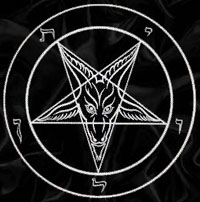
But making horrorcore shit with a lamb is just so nonsensical. Shoulda at least went with a goat on some satanic shit.

You could have modded the pentagram into a star of David too.
But making horrorcore shit with a lamb is just so nonsensical. Shoulda at least went with a goat on some satanic shit.

You could have modded the pentagram into a star of David too.
Props:
Incisions and Incisions
remove violence of the lambs, & replace it with LA's Most Blunted, wah-lah.
1000 times better.
leave a bit to the imagination like, why is this little girl with a lamb thats gonna bite her face off? how are they gonna say LA's most blunted, with an innocent little girl on there.
1000 times better.
leave a bit to the imagination like, why is this little girl with a lamb thats gonna bite her face off? how are they gonna say LA's most blunted, with an innocent little girl on there.
i get what everyone is sayin wit the cliche' lamb bs and thats not what lamb is at all. i can safely say i've never owned an icp album or fucked wit anythin juggalo related in my entire life. it's not that i'm against it...i think tech n9ne is one of the best to do it, and the juggalo fanbase basically revived lynch's career. but that's not what i grew up on..
the idea of la's most blunted on the covers is a good one, tho.
Props:
S.SAVAGE and S.SAVAGE

1000 times better.
leave a bit to the imagination like, why is this little girl with a lamb thats gonna bite her face off? how are they gonna say LA's most blunted, with an innocent little girl on there.
Agree with this post ^^
I would also tone down the creepyness of the lamb on the cover and make it a bit more subtle....almost like the lamb has just a hint of a sinister look and is winking at the person looking at the cover
I think Gemini made a great point. Most of us here if not all of us on the Sicc had no clue whatsoever as to what Lamb is or was. It's one thing to see the word lamb, but to see an actual lamb on the cover of a supposed rap cover strikes me as hella weird. And I am in no way attacking you, your character, your group...none of that. To me, the marketing is waaaay off.
The hell with the picture of the lamb.
If it's la's most blunted, then let that shit be known.....
Cause like Gemini said in so many words....Im not clickin shit if I cant find inspiration in the cover. And thats not to say I havnt clicked on ur music links b4 because I have, and I've actually liked a few..
My favorite which you never even posted here is that G' Extravagant 7 days a week (we smokin)
[video]http://www.youtube.com/watch?v=ltvAfcpC2aI[/video]
On my mama that shits tight....
But if that song was on a cd in which the cover had ANY white lamb doin ANYTHING....I probably woulda never heard the song...if this was '96
And who knows G, me bein optimistic....maybe if you hooked up with an ill ass graphic artist who could incorporate all your thoughts (white lamb included) into a sweet ass pic..logo or sumthin......who knows

