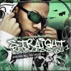
M MediaCore Ent. Fresh Feb 15, 2007 #1 Jun 11, 2006 20 0 0 38 www.myspace.com Feb 15, 2007 #1 M MediaCore Ent. Feb 15, 2007 What up, i did this for a artist named Brax. Just wanted to let it get critique before the final. Thanks!
What up, i did this for a artist named Brax. Just wanted to let it get critique before the final. Thanks!
kingsvillektp Sicc OG Feb 15, 2007 #2 Sep 22, 2006 887 2 18 35 Houston Feb 15, 2007 #2 kingsvillektp Feb 15, 2007 shit looks tight, very eye catching. good job.
RicoSuave Sicc OG Feb 24, 2007 #3 Nov 11, 2003 219 0 0 37 www.royalheirent.com Feb 24, 2007 #3 RicoSuave Feb 24, 2007 yea, man...that's dope
underground Sicc OG Feb 24, 2007 #4 Apr 9, 2005 9,480 78 0 40 www.myspace.com Feb 24, 2007 #4 underground Feb 24, 2007 dope im feelin it. but why is the reflection on his glasses the thing thats behind him?
INCHEZ Sicc OG Feb 25, 2007 #5 Jan 2, 2003 2,175 0 0 40 Feb 25, 2007 #5 INCHEZ Feb 25, 2007 Very Dope ...Love the Color Scheme
M MCKadafi Sicc OG Feb 25, 2007 #6 May 17, 2005 1,689 22 0 41 Feb 25, 2007 #6 M MCKadafi Feb 25, 2007 can i see a bigger version?
D-Skrilla Sicc OG Feb 25, 2007 #7 Sep 16, 2002 4,118 37 0 40 www.2coldgraphiks.com Feb 25, 2007 #7 D-Skrilla Feb 25, 2007 MCKadafi said: can i see a bigger version? Click to expand... yeah, but from what I can see it looks very good.
MCKadafi said: can i see a bigger version? Click to expand... yeah, but from what I can see it looks very good.
N ninouno Member Feb 26, 2007 #8 Mar 15, 2006 75 0 0 42 Feb 26, 2007 #8 N ninouno Feb 26, 2007 brooklyn kid font sucks - tag it yourself
N N*Sane Senior Member Feb 28, 2007 #9 Sep 20, 2002 1,272 0 0 Feb 28, 2007 #9 N N*Sane Feb 28, 2007 kingsvillektp said: shit looks tight, very eye catching. good job. Click to expand... yea nice work i like the layout, sicc
kingsvillektp said: shit looks tight, very eye catching. good job. Click to expand... yea nice work i like the layout, sicc