Tell me what you think "Kenenski"
- Thread starter TriFlen Locc
- Start date
TriFlen Locc said:
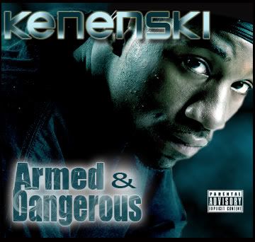
I was messin with Photoshop cs2 and I came up with this...Its a album cover of my homeboy from the group "Aluzjun" Its a Seattle group. Tell me what you guys think.
TriFlen Locc said:
for REAL!!! Let me see what U can do....................sucka
I think the fonts should match, but the glowing part around "armed and dangerous" needs to go. And its too dark around the neck. Did you just blacken it? It looks like it is blackened on the head part too, there should be a little bit of the doo rag visible with a shadow. You are also limited due to the fact that the image is cut off from the start. Also there is no concept to the design. Nothing to go with the title. The pic is too big and gives nothing to the imagination. I'm just giving honest feedback. And yes I could do better so don't get all bent.