FADE MAFIOSO COVER
- Thread starter Nick470
- Start date
there's a difference between it standing out and it not matching up
and i understand art it's what i do for a living
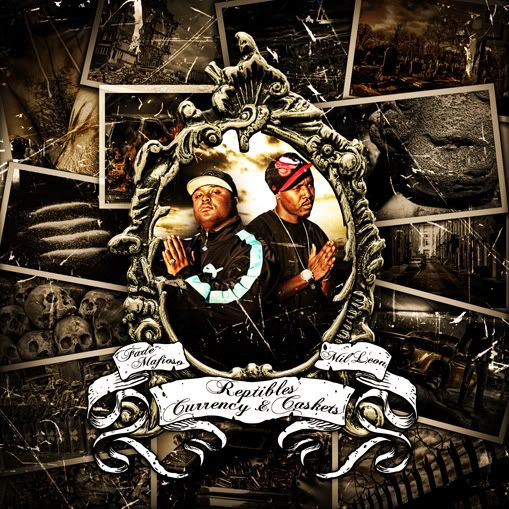
you have a theme going with the cover with the grimey kinda old feel with the brownish tones, then you have the pic in the middle, which is hella overdone with the lucis art effects and then it's hella bright red and yellow, i'm saying just fix the color a little bit, the bright ass red don't fit, it can still stand out without it clashing
and i understand art it's what i do for a living
you have a theme going with the cover with the grimey kinda old feel with the brownish tones, then you have the pic in the middle, which is hella overdone with the lucis art effects and then it's hella bright red and yellow, i'm saying just fix the color a little bit, the bright ass red don't fit, it can still stand out without it clashing
there's a difference between it standing out and it not matching up
and i understand art it's what i do for a living
you have a theme going with the cover with the grimey kinda old feel with the brownish tones, then you have the pic in the middle, which is hella overdone with the lucis art effects and then it's hella bright red and yellow, i'm saying just fix the color a little bit, the bright ass red don't fit, it can still stand out without it clashing
