GrafsiccDesigns Sicc OG Aug 5, 2008 #1 Jul 2, 2008 889 2 0 44 myspace.com Aug 5, 2008 #1 GrafsiccDesigns Aug 5, 2008
L lil_wattage Sicc OG Aug 5, 2008 #2 Jan 6, 2003 1,092 0 0 www.midwestinvasion.com Aug 5, 2008 #2 L lil_wattage Aug 5, 2008 shits coo....
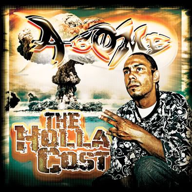
tosin Sicc OG Aug 5, 2008 #3 Feb 28, 2004 3,649 109 63 46 www.thescrewshop.com Aug 5, 2008 #3 tosin Aug 5, 2008 looks dope other than his name looks like A-COME to me... i dont think the square in the bg is needed...
looks dope other than his name looks like A-COME to me... i dont think the square in the bg is needed...
GrafsiccDesigns Sicc OG Aug 5, 2008 #4 Jul 2, 2008 889 2 0 44 myspace.com Aug 5, 2008 #4 GrafsiccDesigns Aug 5, 2008 yeah i already was thinkin the first b in bomb looked funny i gotta fix it...
numba2stunna Sicc OG Aug 5, 2008 #5 Jun 4, 2004 3,183 7 0 Aug 5, 2008 #5 numba2stunna Aug 5, 2008 Fix the A-Bomb text try a different style I don't care too much for bevel/embossed text..... makes it look like said previously A-Come
Fix the A-Bomb text try a different style I don't care too much for bevel/embossed text..... makes it look like said previously A-Come
underground Sicc OG Aug 5, 2008 #6 Apr 9, 2005 9,480 78 0 40 www.myspace.com Aug 5, 2008 #6 underground Aug 5, 2008 dope shit mayne, just fix the "bomb"
FatBlunts209 2 SWISHERS = 1 BLUNT Aug 6, 2008 #7 Feb 21, 2008 7,204 2,840 0 39 STOcKTON Aug 6, 2008 #7 FatBlunts209 Aug 6, 2008 thats tight as fuck
prodigy91 @jordvnxsf Aug 6, 2008 #8 Mar 20, 2008 8,955 513 0 32 SF Aug 6, 2008 #8 prodigy91 Aug 6, 2008 clean
T threexkrzy Sicc OG Aug 6, 2008 #9 Oct 30, 2005 2,132 32 48 Aug 6, 2008 #9 T threexkrzy Aug 6, 2008 yup that "a bomb" font gotta go
azryda420 Sicc OG Aug 7, 2008 #10 Jun 23, 2003 5,126 4 0 43 Aug 7, 2008 #10 azryda420 Aug 7, 2008 Try making the first b in bomb in caps. Like the last b in it. I think the cover has good colors. I dig it.
Try making the first b in bomb in caps. Like the last b in it. I think the cover has good colors. I dig it.
GrafsiccDesigns Sicc OG Aug 7, 2008 #11 Jul 2, 2008 889 2 0 44 myspace.com Aug 7, 2008 #11 GrafsiccDesigns Aug 7, 2008 yeah i think its the same b but the bulge warp on the text bends it a different way.....it goes little to big in the middle then bacc to little again....im a fucc with it but i been busy cuz im about to move out your way next week man....
yeah i think its the same b but the bulge warp on the text bends it a different way.....it goes little to big in the middle then bacc to little again....im a fucc with it but i been busy cuz im about to move out your way next week man....
INCHEZ Sicc OG Aug 11, 2008 #12 Jan 2, 2003 2,175 0 0 40 Aug 11, 2008 #12 INCHEZ Aug 11, 2008 Nice work mayne... Real clean Love the color scheme