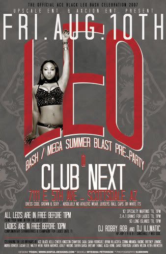
this was the 1st draft...and she didnt like the yellow and wanted some changes (some of which were never mentioned during consultation)...

and this is what went to print...

i prefer the yellow version as she was going to be using them as flyer/business cards (an after thought) and i think yellow grabs more attention...
i also did a flyer which is a combo of the info from both sides of the biz card...

what do yall think?

and this is what went to print...

i prefer the yellow version as she was going to be using them as flyer/business cards (an after thought) and i think yellow grabs more attention...
i also did a flyer which is a combo of the info from both sides of the biz card...

what do yall think?


