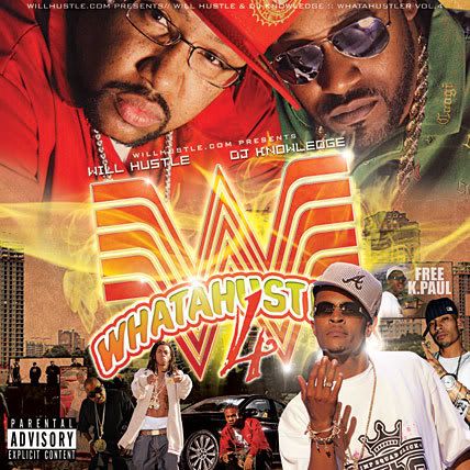
WhatAHustler Vol.4...
- Thread starter tosin
- Start date
the best one out of the series so far, typography is on point, the color scheme and texture is nice
one thing that catches my eye is the billboard, well the white on the billboard it should be grayed down or de-saturated a bit to give it the effect of perceptive/distance, kinda like the image behind Trae but not as much cause the free K-Paul billboard holds an important message
one thing that catches my eye is the billboard, well the white on the billboard it should be grayed down or de-saturated a bit to give it the effect of perceptive/distance, kinda like the image behind Trae but not as much cause the free K-Paul billboard holds an important message


