What-A-Hustler 3...
- Thread starter tosin
- Start date
)-HANGMAN-( said:
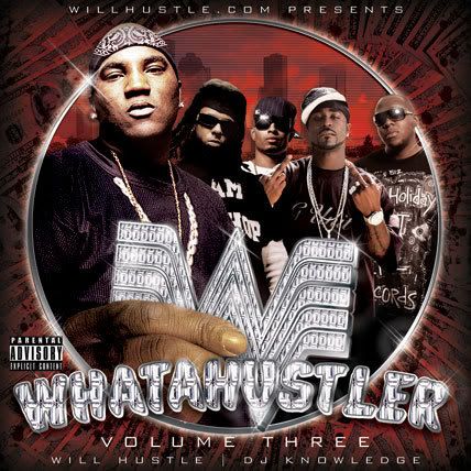
nbut not really feeling the text for whatahustler on this one.
)-HANGMAN-( said:
and the hand holding the logo doesnt really fit with jeezy
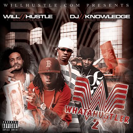
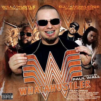
this is the same kinda idea...

)-HANGMAN-( said:
and i think the black hands throwin up birds doesnt really look right either.
yeah the diamonds in the font make it hard to read with the silver outline on it. maybe a smaller scale of diamonds might do better.
and for jeezy's hand i know its suppose to have the in your face look but i dont know it seems too low. and some lighting throws it off. maybe its the circle that all the artists are in that seems like a cutoff and the hand doesnt really fit to me.
and thats understandable about the black hands but it just stood out way to much for a minor defect. but if thats what they supplied u then thats only what u could do. i got ya man.
C
tosin said:
its ugly i know...but its the what-a-burger font...but the purpose is a play on words...since most of yall are out in cali yall may not be familiar w/ what-a-burger....


we aint got what a burgers in cali so a lot of folks here probably wouldnt recognise it but i did right away cuz i used to work at one in arizona lol....clean shit man.....


