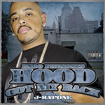
The Hood Got My Back...

  • Wanna Join? New users you can now register lightning fast using your Facebook or Twitter accounts.
C

CcytzO_Loc

Guest
#6
nice...i like the reflection in the sunglasses and the textwork is clean...
 
Apr 4, 2004
667
0
0
45
bgngraphics.com
#7
I like every thing except the background color scheme

this choice might be out of your hands

but I think a red or green would look much better

or just tint the greens in their pics to orange or blue

and the reds to orange
 
Mar 17, 2007
223
0
0
37
#8
its good, only thing that throes me is the guy on the right not being as 'grainy' as the guy on the right, other than that its hot, nice color scheme!
 
Jan 2, 2003
2,175
0
0
41
#9
like they said about the grain^^^^^

also maybe lighten up some areas of the background....to differentiate the skyline from the cityscape...looks some what monotone........

Overall a tight peace...

keep em comin
 
Jan 30, 2004
947
25
0
#13
the building right behind them is so plain/blocky and covers up the cityscape in the background, i think it might look better without that. other than that it looks good to me.
 
Feb 28, 2004
3,649
109
63
46
www.thescrewshop.com
#17
azryda420 said:
I think the people need to be smaller. The font is coo as hell tho.

they really cant be cuz their heads are cut off in the pics they submitted...but the client has fucked off the cover cuz the cat on the right can no longer be on the cover yet hes hosting the cd...wtf kinda since does that make?
 

Defy

Cannabis Connoisseur
Jan 23, 2006
24,139
16,657
0
45
Rich City
#18
that doesn't seem like what a cover for something titled "the hood got my back" there's noone behind them.....and you can't really see their "hood", just one wall and the downtown skyline. I'm just not feeling the cover's concept at all