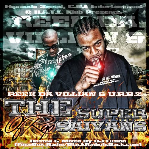
I figured I'll post something since I havent in a while. I wanted to go with a dragon ball-Z theme on this cover because of the title, but they wanted something dark.
I think the "The" and "Super" should look more like the "Saiyan". And like they said too much text, what can you do tho. Also what's so Dragon Ball about it?
I think the "The" and "Super" should look more like the "Saiyan". And like they said too much text, what can you do tho. Also what's so Dragon Ball about it?
I figured I'll post something since I havent in a while. I wanted to go with a dragon ball-Z theme on this cover because of the title, but they wanted something dark.
I think both designs effects are way overdone.......sometimes effects being used is done a little too much to the point it starts to get busy and look bad.....