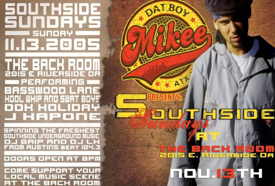
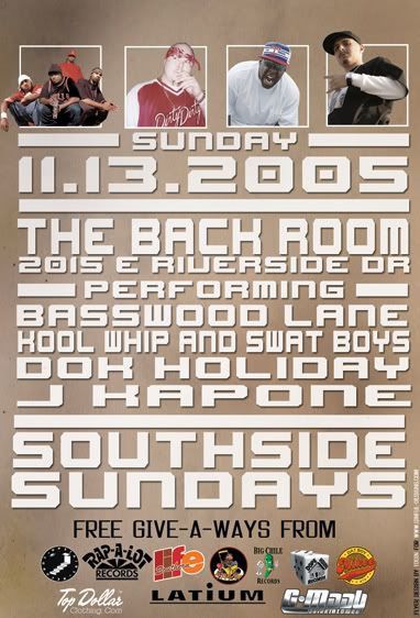
Southside Sundays Flyer

  • Wanna Join? New users you can now register lightning fast using your Facebook or Twitter accounts.
Apr 25, 2002
1,047
0
0
40
#3
I like the first one except how the text on the right is bumped to the edge. And on the 2nd one nothing is centered, maybe a weird template? I dont know. Still a solid design tosin.
 
Feb 28, 2004
3,649
109
63
46
www.thescrewshop.com
#4
OverDoze said:
And on the 2nd one nothing is centered, maybe a weird template? I dont know. Still a solid design tosin.
ya im still messing w/ the scale of things and getting them all justified and aligned...

but im not happy w/ the text on the right side of the front of the flyer...


T-Craq said:
not really a style I prefere or simply too simple, dunno
i feel ya...just trying new things...
 
Nov 28, 2003
544
0
0
37
#10
one thing on the back cover did disturb at first sight, it's how the text is positioned, I dunno if it is the same on the front but at least it doesn't look like it...

I uploaded a pic showing you what I mean:
 
Feb 28, 2004
3,649
109
63
46
www.thescrewshop.com
#11
T-Craq said:
but the sizes are different, aren't they?
naw one i just turned 90...

T-Craq said:
one thing on the back cover did disturb at first sight, it's how the text is positioned, I dunno if it is the same on the front but at least it doesn't look like it...

I uploaded a pic showing you what I mean:
i see what ya saying...the alignment is off...