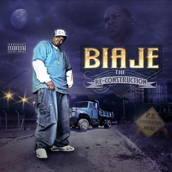
New Cover (Biaje Get Gone records)
- Thread starter DubbA
- Start date
Big T Barajas said:
Real nice man, I'm loving the details of it (the "Re-Constrution Ahead" sign), very dope. But I think you should get rid of the face in the sky and move the logo and album title up to the top and move the parental advisory down to the bottom, just a thought.
Keep it up.
Keep it up.
and the pa is in an odd place...


