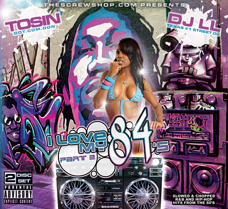
I Love My 84's Pt. 2...
- Thread starter tosin
- Start date
yeah part 1 was more bout the rim itself...
but the whole theme of the tape is music from the 80s...this time around its double disc and fts r&b and rap from the 80s...
so w/ this cover i wanted to use both...if you notice the rims are in the speakers of the boombox...and there are 2 this time...cuz its part TWO...and i wanted it the 80s theme w/ the loud colors and the graf...

definitely has a different feel to it that any work I've seen from you. over all I think it blends well and the boombox with the 84's on it is really dope.
not really feeling the I love my 84's text, it works well on the green cover but for some reason it doesn't sit right with me on the new one. maybe try lowering the opacity on some of the white circles
not really feeling the I love my 84's text, it works well on the green cover but for some reason it doesn't sit right with me on the new one. maybe try lowering the opacity on some of the white circles
dope, i got part 1 so im a be gettin this one too


