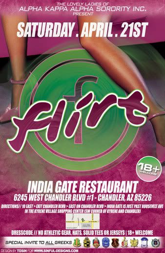
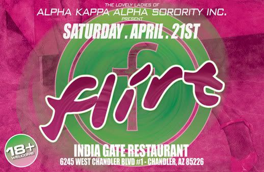
Flirt Party Flyer...
- Thread starter tosin
- Start date
BGN79 said:
tight I like the watermelon color in the 18+ and the start up button f
typography looks on point if I were to nip pick I'd want more spacing between the map and the text and maybe rounded corners on the map. but that just small things and my preference
typography looks on point if I were to nip pick I'd want more spacing between the map and the text and maybe rounded corners on the map. but that just small things and my preference
the map was an unplanned update and was rushed to go to print...im not a fan of maps on flyer cuz usually you cant read them anyway...


