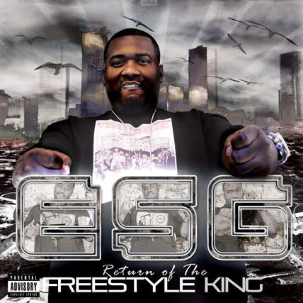
ESG - Return of the Freestyle King
- Thread starter tosin
- Start date
the issue w/ his face is hes showing his grill....
the original artwork had lil flip in one hand and slim thug in the other...king kong style as you said...
the theme is he wrecked the city...thats why the city looks a lil beat down and hes in a tour down area...'wrecking' means 'doing good rapping' to be as white as i can...lol
the original artwork had lil flip in one hand and slim thug in the other...king kong style as you said...
the theme is he wrecked the city...thats why the city looks a lil beat down and hes in a tour down area...'wrecking' means 'doing good rapping' to be as white as i can...lol
ummmmm ... I dunno bout this piece mayne, I see a blue shade on his hands but nowhere that the light is coming from (I pay close attention to those sorta things, sorry) The blending mode you used on tha skyline dont go well either. Lightin and blending is off abit. Only thing I can say i like is tha text, once again every different from other stuff.
Nice work still.
Nice work still.
i like the background a lot...& the ESG text looks coo. but with all that text, & the big ass picture in the way, it's difficult to see the concept you're going for without being told 1st. plus the origional concept sounds better (crushing flip & thug), & would help illustrate tha whole "king kong tearing down/wreckin shit" idea
& whether he's "showing his grill" or not, he seriously looks mentally challenged in that pic. that's the 1 part that deffinitely needs to change, cuz he will get laughed at in stores for that look on his face. dude just wrecked tha city, he shouldnt have that goofy ass facial expression! he should be mean muggin n shit lmao.
besides, all that "grill" shit's played out...
I see what you were going for with the wreaked building and shit, but it just doesn't "read" right away... you know. It took a minute to see what was going on and with a cover you're supposed to know what's going on in an instant.... feel me?
Good job though I like how the background looks but needs more destructive look.
Good job though I like how the background looks but needs more destructive look.


