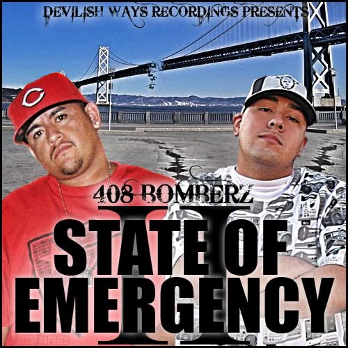
Cover for Trajik1's group
- Thread starter Toro
- Start date
i think the ideas sick..the way u put in the cracks and made the bridge fall apart was a cool idea, I also like the "408.." text that came out sick but theres a few things workin againts it. The main text needs to be worked on..its just plain and black, which can work in alot of cases but this cover looks like it needs more. The photos r killin it I think, their quality, their coloring, the way they blend together. i donno if you can get your hands on better pics from him or not but it would be a good idea, and a better quality pic for the background..and blend them together better. also maybe like someone else said, make the bridge falling apart more so its more noticeable


