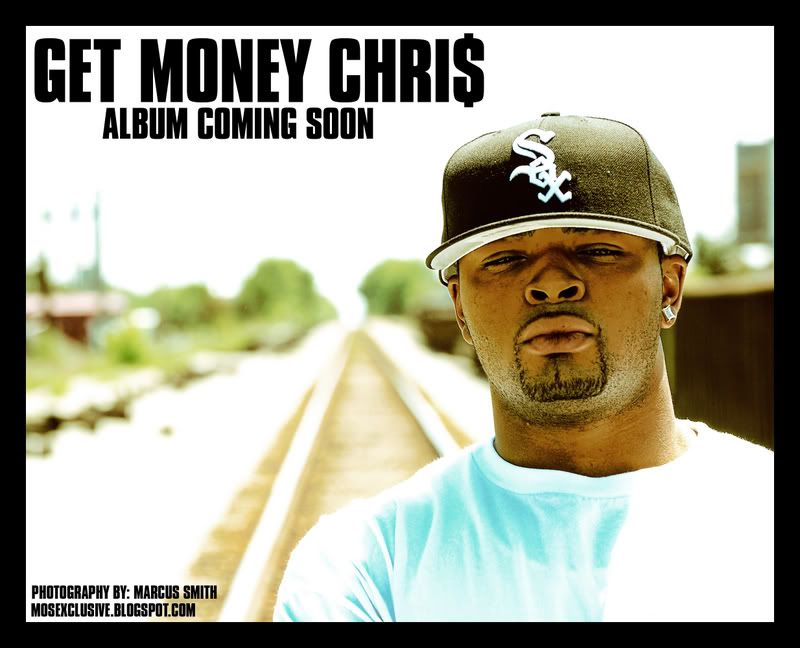
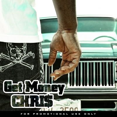
cover and ad
- Thread starter mosexclusive
- Start date
yeah the green tone is a lil too much on the front cover, it makes things like his hat too contrasty with green tones. Id kick down the green tones on the front a lil and bring them out a lil more on the back, if u wanna keep the green that is. U might wanna change the fill to the "Get Money Chris" too, it doesnt work so well on the back wen its againts the pocket IMO. If ur gonna put tracks on the back too u might wanan test that out
The thigns I like are all the photographs and the way u cropped them to put them on the covers. The little design on the bottom of the front cover (maybe u could carry it thru to the other side). I also like the fon you used for the "get money chris". my favorite thing about the cover is the simplicity, its not all photoshoped up and shit
The thigns I like are all the photographs and the way u cropped them to put them on the covers. The little design on the bottom of the front cover (maybe u could carry it thru to the other side). I also like the fon you used for the "get money chris". my favorite thing about the cover is the simplicity, its not all photoshoped up and shit


