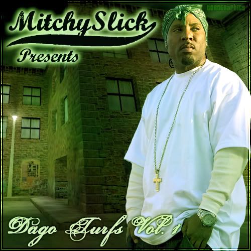
2 New wallpapers plus a quick cover
- Thread starter Toro
- Start date
im feelin the wallpapers, i like that style u do for alot of ur backgrounds on shit. The album cover is a lil less then ok IMO, i think itd be alot better if u made Mitchy more like he was really next to those buildins (lighting and perspective looks fucked up), they look like 2 seperate objects right now


